What comes to mind when you hear “accessibility (A11Y)”?
Most people probably think of considerations for learners with physical limitations—things like “colour contrast,” “captions,” and “alternative text”—in other words, inclusive design. Of course, these are essential foundations for any learning environment.
However, an Instructional Designer’s work doesn’t end there.
Among the accessibility challenges IDs must address is the cognitive barrier of “how to understand and act upon” content filled with technical jargon.
What “Accessibility” Means in ID
Accessibility (A11Y) refers to the state where anyone, regardless of their abilities or environment, can access and use information and services.
While the general IT field focuses on removing physical and technical barriers, accessibility in Instructional Design (ID) goes a step further. It ensures not just that information is visible or audible, but that individuals can “understand that information and change their behavior.”
From an ID perspective, accessibility consists of two key elements:
- Physical Accessibility (Inclusive): Design that promotes physical “usability,” such as font size and colour contrast.
- Cognitive Accessibility: Design that removes barriers to learning and understanding (cognitive load), such as breaking down technical terms into simpler language or illustrations.
Let’s look at some concrete examples.
1. Physical Accessibility: The same information, yet…
Let’s examine accessibility from a physical perspective.


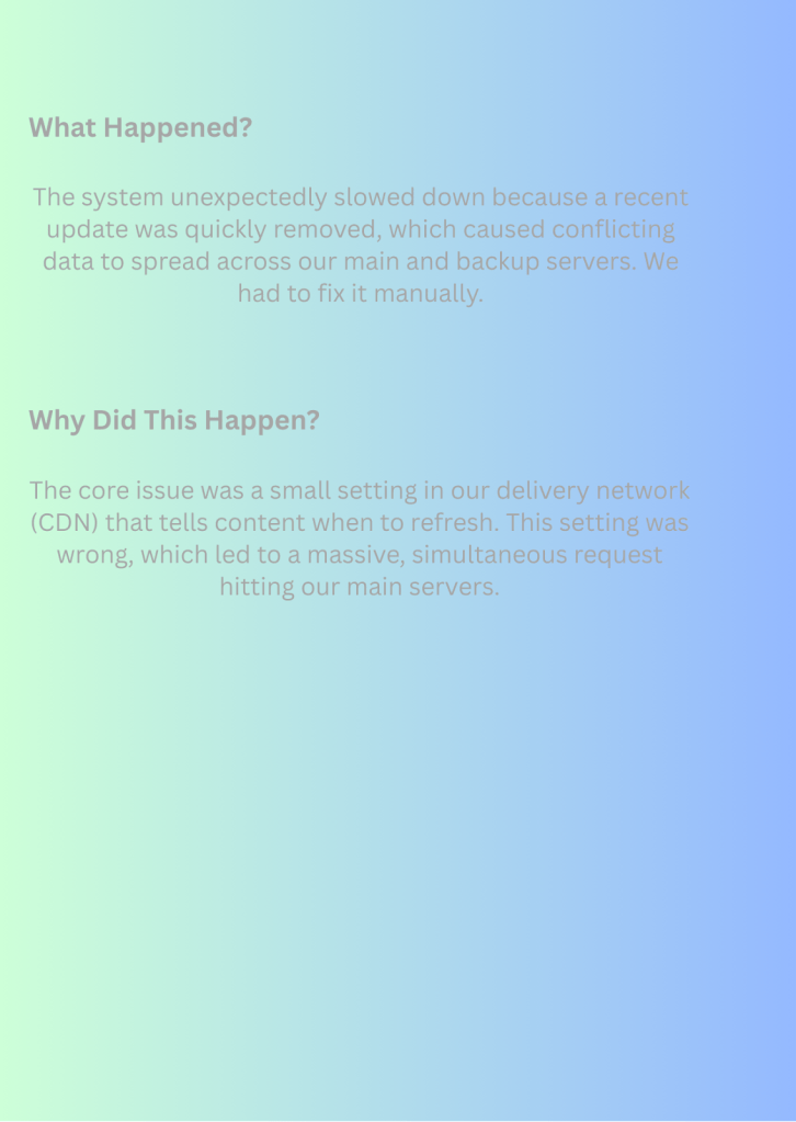
Both of these convey the same message. Which is easier to read?
At first glance, the left side is more colorful and eye-catching, but the contrast between the background and text colors is insufficient, and the text size isn’t exactly “easy to read.” On the other hand, the right side is simple, but the contrast between the background and text is clear, and the text size is appropriate.
The right side, with its appropriate contrast and size, is the information that everyone finds “easy to use.”
2. Cognitive Accessibility: Same content, yet…
Next, let’s look at it from the perspective of cognitive accessibility.


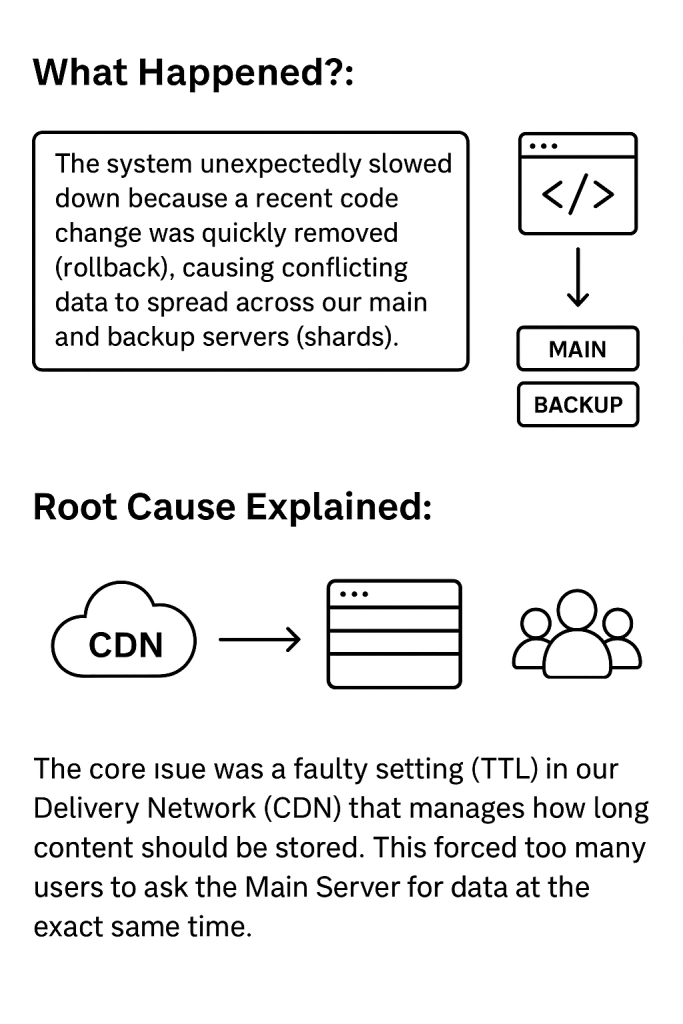
Both convey the same content, but how do they appear?
Few people reading the left recipe would likely visualize the process clearly. Unless you’re an expert, it probably doesn’t convey much meaning.
In contrast, the right side breaks down technical terms into accessible language for a general audience and uses illustrations to supplement the text.
This demonstrates how translating information into “usable knowledge” is the core competency of instructional design.
Key Points for Achieving Accessibility
In instructional design, it’s crucial not to view things solely from the designer’s perspective, thinking “I understand it, so everyone else will too.” We must incorporate design strategies that ensure any learner can “understand, remember, and utilize” the information.
Key points include the following:
✅ Checklist: Physical Accessibility
| Item | Purpose and ID Checkpoint |
| Text Size | Is the text scalable and readable across all devices (desktops, mobile phones, etc.)? |
| Colour Contrast | Is the contrast between background and text sufficiently clear? Does the background color make the text difficult to read? |
| Media Size | Are inserted images an appropriate size? |
| Spacing | Is there adequate spacing between characters and lines? |
✅ Checklist: Cognitive Accessibility
| Item | Purpose and ID Checkpoint |
| Translation of Jargon | Is the content understandable regardless of the learner’s prior knowledge level? Are industry terms and abbreviations translated into plain language learners already know? Are definitions provided upon first use? |
| Consistency in Structure and Navigation | Can users understand where they are and where to go next? Are chapter structure, headings, and navigation button placement/functionality consistent throughout the material? |
| Concise Writing Style and Bullet Points | Can information be processed quickly? Are sentences kept short? Is active voice used frequently? Are bullet points actively used to reduce text density? |
| Focus on “Absolutely Essential” Information | Can learners concentrate on what they need to learn? Is background information the SME “wants you to know” separated from “absolutely essential” information directly tied to performance? |
| Multi-modal information presentation | Are multiple means available to aid understanding? Beyond text, are visual elements like diagrams, graphs, and infographics used to reinforce key concepts? |
Reference: https://www.w3.org/WAI/
Summary: Accessibility is the Differentiation Strategy for ID
Accessibility work is not merely about technical compliance. It is the ultimate role of Instructional Design (ID) to maximize effectiveness for all learners by removing “barriers to achieving objectives.”
This accessibility-conscious learning design ultimately produces materials that are clear and efficient for everyone.
Achieving accessibility is the strategy that differentiates project success and the value you bring as an instructional designer.
【For Corporate Training & ID Solutions, connect with us below.↓↓↓】
→ [Contact Us]

Leave a comment